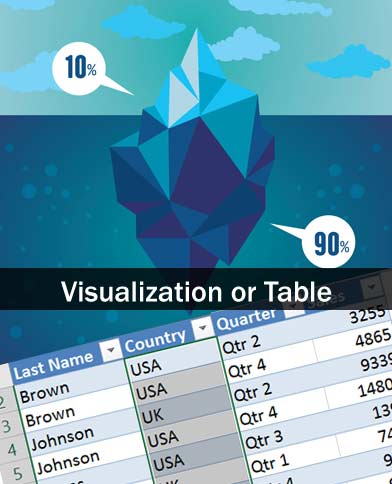
“It’s really just a report. We’ll put in a table.”

This quote, or a variation of it, has been uttered by countless developers looking to shave some time off their scope-inflated corporate mandated deadline. This can be translated in UX terms as “All those cool data visualizations that you created now can be collectively categorized as ‘Future Enhancements'”. Or in other terms, “portfolio creative exercises”, since typically the likelihood of project inclusion falls right around “Photographing a Sasquatch riding a Unicorn emerging from Atlantis”.
Tabular Data in an application typically generates the knee jerk reaction of beating head against wall for most UX designers/developers. Cognitively, it’s easier for the human mind to comprehend and absorb useful data when presented in some well designed chart, graph, or other visual display of information, right?
Actually, in my opinion, it’s contextual. Some research studies show that there isn’t a clear advantage to tabular display of data over charts or graphs, or even support the opposite.
“We found that displaying data in a table lead to more accurate answers than the choice of bar charts or pie charts”
I can cite examples where complex visualizations take longer to comprehend than comparable tabular data, as well as examples to the contrary. I believe there is enough evidence to demonstrate that contextual elements such as visualization type, context of data, labeling, legends, visual design, aspect ratio, screen resolution, or any other number of variables could influence studies towards one conclusion over another. That said, I view research on this matter suspect, and potentially contextually biased.
Returning to the original problem, a decision based upon development ease and alternate internal influences that put well designed UX data visualizations at risk, what leverage can a UX professional utilize to overcome opposition to visualizations that can benefit the end user? Especially if the research on graph/chart comparison to tabular data differs in findings?
Some might argue that tabular data is better than data visualizations. Others might strongly oppose that view. Rather than take a divisive position against those tasked with building your designs, I’d propose a more successful alternative that is backed by science.
I’ve found success in promoting a corporate policy that all data visualizations provide a toggle or alternative method of viewing the underlying tabular data that generates the visualization. Think of Microsoft Excel and how each data visualization links to a set of tabular spreadsheet data points. Whatever graphic component you use, in code, the data is most likely an array of data points…..data that is most easily displayed in a table. Providing a toggle from graphic view to tabular view allows users to switch to the view that they can contextually comprehend more quickly.
Visualizations might in some context be superior to tabular data, but clearly superior to providing an either-or proposition is providing both options.
Users that are visually engaged will be able to comprehend the visualization with user engagement. Users that are more comfortable with tabular data absorption or visually impaired users will prefer the tabular format.
It’s been my experience that setting the precedence, either by formal or informal policy, of offering both display view options has a higher likelihood for inclusion of data visualizations, even if it’s only because of the inherent nature of software teams to eradicate inconsistencies within the application. And if the expectation is that each instance of visual data display will also have a table view, it’s far less likely to be edited from the project scope.
In addition to having both view options, I’d also encourage that filtering options in one view also be included in the other view. As a general rule, I view every chart, graph, or other visualization as only one half of what is to be included in the application. Everything in the visualization is also in its corresponding table. From a development perspective, tabular data is easy to present. That’s exactly why it’s so common, a developer can take an array and build a dynamic table with minimal effort. So defining a visualization AND adding a table to it is not a large development investment. One could argue that it will speed QA testing by quickly providing an available reference table for the chart/graph.
Ultimately, by providing both options for your users, their comprehension will be faster or equal to providing a lone solution. And consistency will allow users to anticipate and navigate view options through a learnt process over time. That’s science that will not only benefit the users but also help keep the internal development focused on UX instead of being tempted to cut corners in the interest of internal development efficiency.
Software should be built for the efficiency of those using the product as opposed to the convenience of those creating it.
